QuickBite
Reducing campus dining decision fatigue through real-time intelligence
Role
Solo Product Designer / UX Researcher
Timeline
Jan 2026 – Feb 2026
Team
Solo project
Tools
Figma · Interviews · Journey Mapping
What is QuickBite?
QuickBite is a mobile app designed for University of Michigan students who face a very specific, daily frustration: figuring out where to eat between classes — fast. The app surfaces real-time signals like wait time, walk time, freshness, and crowd levels so students can make a confident decision in minutes, not guesswork.
This was a solo class project for my Digital Product Design course, designed end-to-end — from initial user research through final prototype.
Discovery & Problem Definition
Problem Statement
"University of Michigan students want a way to minimize 'food gambling' moments by getting real-time insights — queues, wait times, sold-out items, freshness — so they can avoid frustration and not settle for an unsatisfactory backup meal."
Core Research Insight
Students were not struggling because there were too few food options. The real issue was uncertainty. With limited time between classes, they needed to know whether a place was actually worth the walk, wait, and money — before committing.
Pain Points
Long or unpredictable wait times with no way to know in advance
Menus that don't match the actual food experience
No visibility into whether food is fresh or already sold out
Too much effort checking multiple apps or walking to the wrong place
Needing to make a quick decision in the minutes between classes
Objectives
- Help users decide where to eat within a few minutes
- Surface the most important context first — time, distance, wait
- Reduce "bad surprise" meal decisions
- Make food choices feel faster, easier, and more reliable
Target Audience
Busy University of Michigan students making food decisions between classes — with varying priorities: speed, dietary needs, budget, and avoiding wasted effort. Research was conducted through user interviews and journey mapping to understand these different contexts.
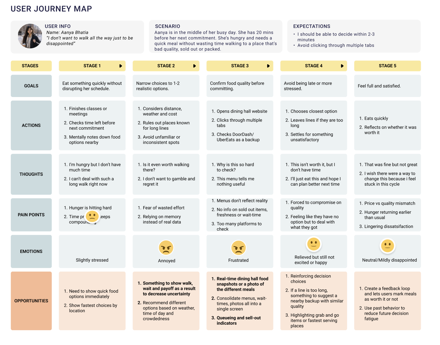
Research Artifact — User Journey Map
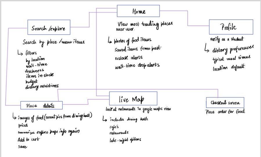
Information Architecture — Site Map
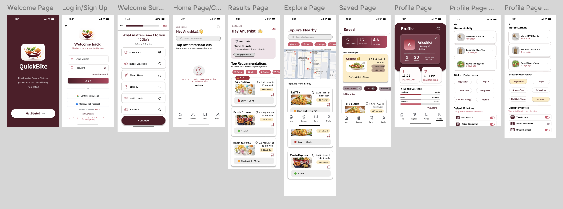
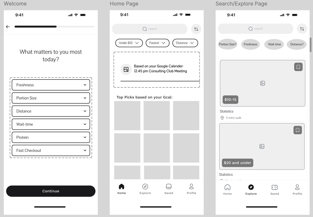
From Sketches to Prototype
I used a clean, mobile-first visual system — rounded cards, clear hierarchy, pill filters, icons, and card-based layouts designed for fast scanning. The burgundy brand color creates warmth and recognition, while soft neutrals keep the interface uncluttered. Every design decision prioritized time-sensitive readability.
Phase 1 — Sketches
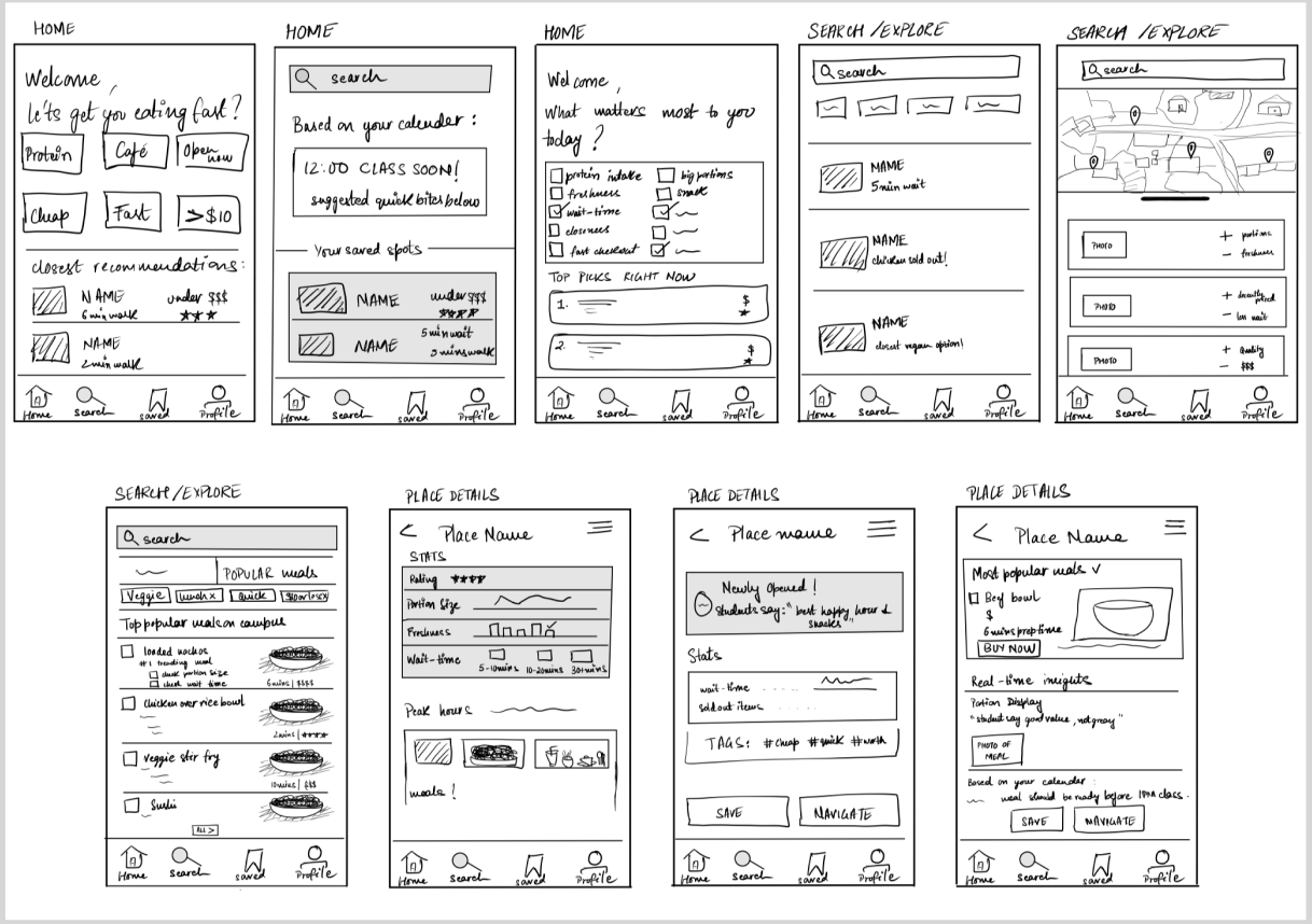
Phase 2 — Lo-Fi Wireframes
Iterations & Feedback
Each iteration was driven by direct user feedback. Here's how the design evolved:
Onboarding survey
Before
Too text-heavy and unclear — users didn't know what to select
After
Simplified with icons, clarified single-select behavior, and strengthened the CTA
Welcome screen
Before
Stacked cards felt distracting and created a cluttered first impression
After
Removed the cards entirely for a cleaner, focused entry point
Results page
Before
Cards felt visually heavy and repetitive — information overload
After
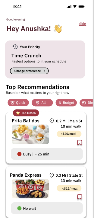
Simplified tags, added quick filters and color-coded wait indicators
Home page
Before
Users couldn't find a clear next step — navigation felt ambiguous
After
Added a prominent search bar and clearer navigation cues to reduce friction
Final Prototype
The final prototype gives students a faster way to choose where to eat by focusing on the signals that matter most in the moment: time, distance, wait, and fit for their priorities. Instead of browsing menu-heavy screens, users can quickly filter, compare, and act. The design shifted away from basic menu discovery toward decision confidence.
Explore the full prototype
Click through the interactive Figma prototype to experience the full flow.
View Figma Prototype →Reflection
This project helped me move away from thinking the problem was about menu discovery. My research showed that the bigger issue was decision confidence — and that insight pushed the design toward contextual prioritization rather than listing food options.
I learned that a good solution is not about showing more information. It's about showing the right information at the right moment — especially when users are making decisions under pressure.