HairSense
Personalized hair diagnosis through environmental awareness and smart symptom tracking
Role
Solo Product Designer / UX Researcher
Timeline
Mar 2026 – Apr 2026
Team
Solo project
Tools
Figma · Interviews · Diary Study · PRD
What is HairSense?
HairSense is a mobile app that helps users diagnose recurring hair issues by combining symptom input, hair type data, routine tracking, and environmental factors — specifically hard water and humidity levels — that most people don't realize are affecting their hair.
The goal is to replace the guessing and trial-and-error cycle with a clear, guided diagnosis experience, so users can understand what is actually causing their hair problems before reaching for a product. This was a solo class project for my Digital Product Design course.
Discovery & Problem Definition
Problem Statement
"People with recurring hair concerns want a fast, personalized way to diagnose what is actually causing their hair issues — including factors like water hardness and humidity they didn't even know mattered — so they can stop the trial-and-error cycle and trust that their routine is working for them."
Core Research Insight
Through interviews and a diary study, I found that users were not lacking products. The real issue was confusion around root causes. Users relied on TikTok or random recommendations without understanding how hard water, humidity, routines, and behavior patterns were affecting their hair.
Pain Points
Not knowing the root cause of recurring hair issues
Over-reliance on TikTok or random social media recommendations
No visibility into environmental factors like hard water and humidity
Difficulty tracking routines and patterns over time
Feeling overwhelmed by too many products with no clear direction
Objectives
- Help users identify root causes before suggesting solutions
- Make invisible factors like water quality visible and understandable
- Reduce trial-and-error product usage
- Create a clear, guided diagnosis flow
- Help users track patterns over time
Target Audience
Young adults dealing with recurring hair concerns — particularly those who experiment frequently with products but don't see consistent results. Research methods included user interviews and a diary study to understand long-term behavior patterns.
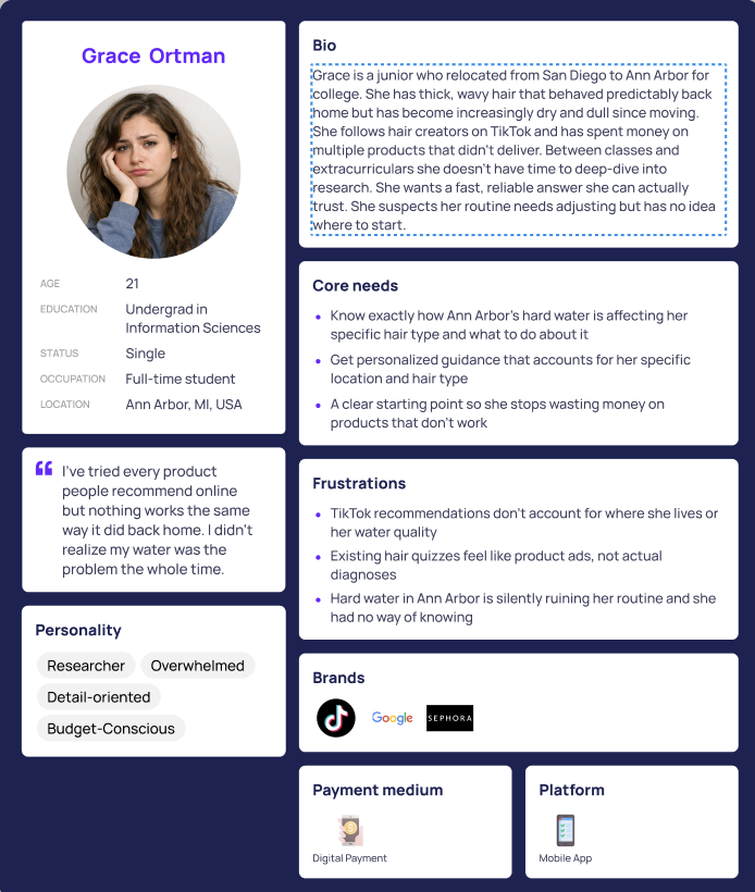
Research Artifact — Primary Persona
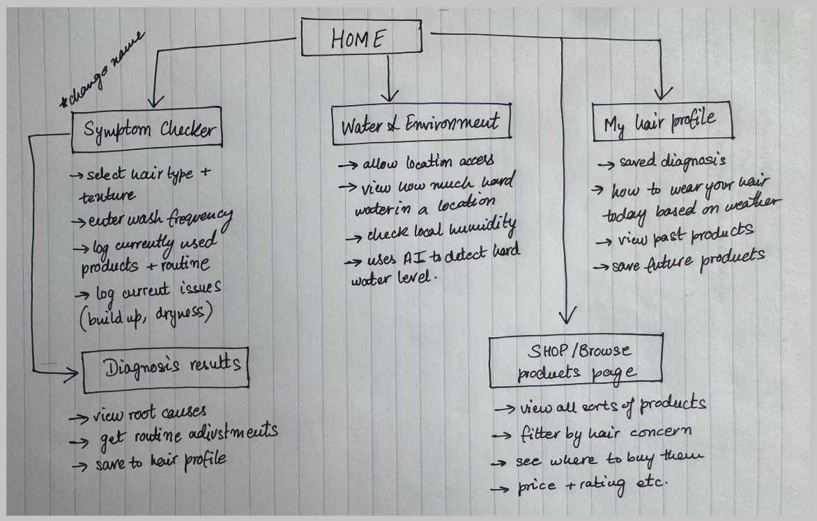
Information Architecture — Site Map
From Research to Prototype
HairSense needed to feel calm, clean, and trustworthy — not clinical or overwhelming. Users are working through personal, often frustrating hair issues, so the design language had to meet them with clarity and warmth.
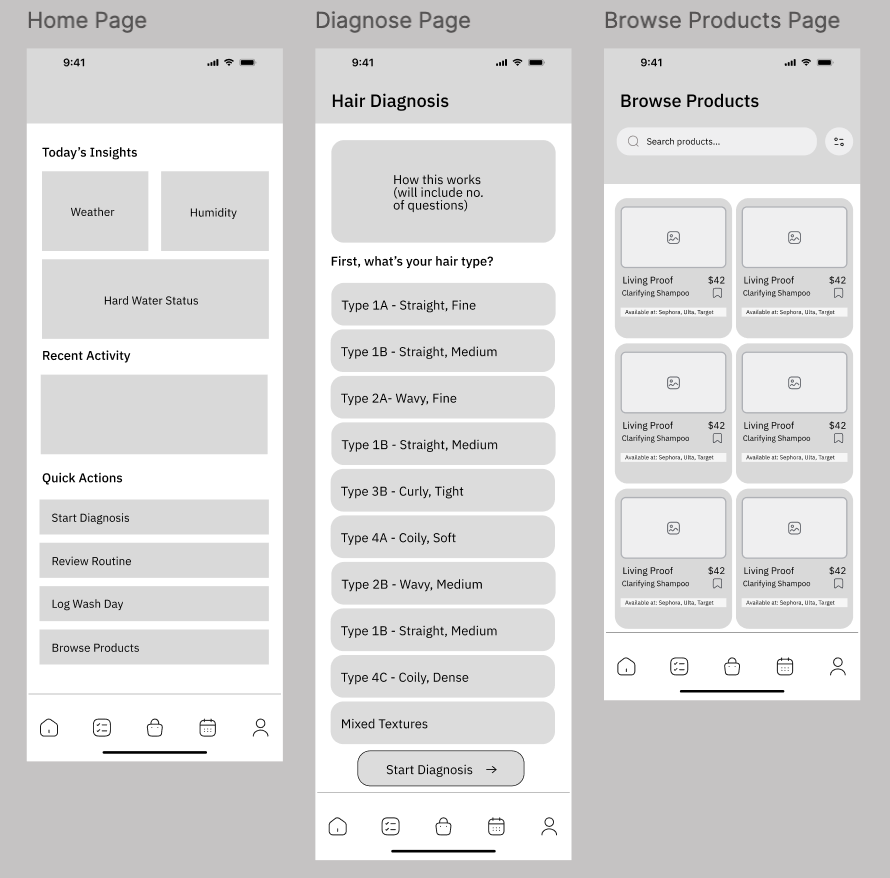
Navigation Structure
Bottom navigation kept key features predictable and accessible — especially for repeat interactions like logging wash days. Card layouts and progressive disclosure ensured users only saw what they needed at each stage.
Phase 1 — Sketches
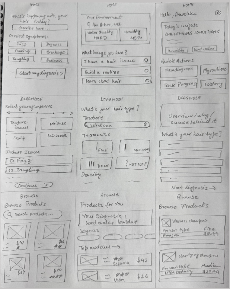
Phase 2 — Lo-Fi Wireframes
Iterations & Feedback
Five distinct areas of the design evolved through user feedback:
Water quality feature
Before
Users liked the feature but couldn't understand what the raw numbers meant
After
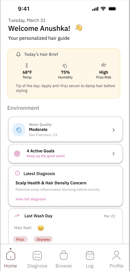
Added simplified labels ("Moderately Hard"), clearer explanations, and a visible home screen button for quick access
Symptom tracking (wash log)
Before
Users needed to log multiple overlapping issues but were limited to single selection
After
Added multi-select options, dropdowns, and tags so users can capture the full picture
Diagnosis flow
Before
The long form felt overwhelming and caused drop-off before completion
After
Redesigned into a paginated step-by-step experience with a progress bar, showing 1–3 questions at a time
Diagnosis results
Before
Users received a final answer with no explanation of how it was reached
After
Added clear reasoning, contributing factors, and breakdowns to build trust in the output
Calendar / pattern tracking
Before
Colored calendar dots had no explanation — users couldn't interpret trends
After
Added legends, labels, and a recurring patterns section to make the data actionable
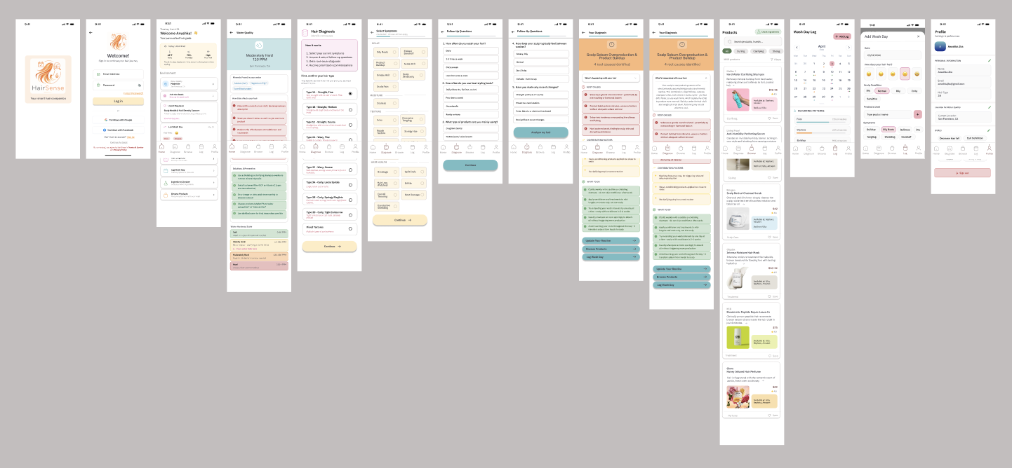
Final Prototype
The final product shifts users from reactive product use to informed diagnosis and pattern tracking. Users can input symptoms, understand environmental impacts, see likely root causes, and track their routines over time — all within one guided, structured experience. Products become a secondary, more informed step rather than the starting point.
Explore the full prototype
Click through the interactive Figma prototype to experience the complete diagnosis flow.
View Figma Prototype →Reflection
My PRD initially focused on product recommendations, but research made clear that diagnosis needed to come first. That insight changed the entire product direction — from a recommendation engine to a diagnosis-first experience, with products as a secondary, better-informed output.
I learned that for complex problems, the challenge isn't adding more features — it's structuring information so it feels simple, guided, and trustworthy. Users trust a system more when they understand how it reaches its conclusions.